July 13, 2014

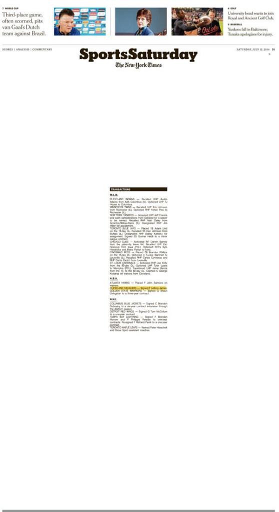
If ever there was a way to get my attention for the section of the weekend newspaper that I never read, this was it.
I normally put the sports section straight in the “done with this part” pile along with the automobile sections. But this arresting front cover on the NYT sports section to day had my mouth form a big “O”.
Something about this made me want to find out what was going on, what the big deal is.
Thankfully, contemporary web design is moving away from that old “fill-up-the-page” look. I never liked it and this is confirmation that putting space around your information is a good idea.


