September 13, 2021
There are nine non-profit organizations in the USA that work with the State Department to resettle refugees. This past August, as the Afghan evacuation took place with the non-profits receiving very little advance notice of the change in schedule, they were all suddenly swamped with the huge number of Afghan evacuees for whom they needed to find homes and communities. With the refugee program having been drastically cut during the Trump years, and without being given any additional funding by the State Department for the sudden wave of new arrivals, these organizations needed to find funding and help from other sources, and quickly.
Any huge change presents an opportunity for the quick-witted to step in and shine. We expect a good business will be that nimble but opportunism isn’t a trait that non-profits necessarily align themselves with. It’s not always well-appreciated that the public relations/branding side of their work deserves the same strategic attention an ambitious corporation will devote to theirs. But it does. If the non-profit’s work is providing value to the world, it’s worth a sharp and agile marketing strategy.
With all the news about Afghan evacuees being brought to the USA and needing homes, it seemed very likely to me that there would have been a lot of people looking for ways to help and donate. I took a look at the digital presence of the nine non-profits who resettle refugees at the end of August to see how they’d pivoted with the situation unfolding.
Of those nine organizations, I’ve selected the following four who were demonstrating the most agile response to the situation on their websites, despite being massively over-worked at the time.
CHURCH WORLD SERVICES (CWS)
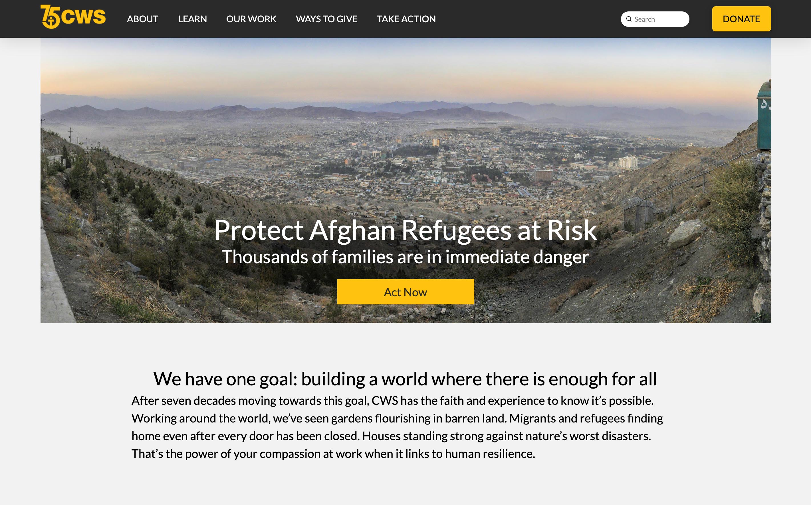
CWS did so many things right. I opened their homepage to find a banner image with a clear, immediate call to “Protect Afghan Refugees at Risk”. The rest of the homepage displayed the regular content but a big yellow “Act Now” button would have taken anyone interested in helping to a page that was designed to first succinctly describe the situation and then offer different ways for people to help.
Look at the way this page makes it easy for the user identify themselves as a warm and generous donor:

This “Take Action” page is exemplary in terms of providing plenty of information, stories and general context to support their request for help. Welcoming statements from a couple of the communities in which the organization resettles Afghan refugees precede the simple form. In fact, there’s a pervasive tone of warmth and welcome throughout the page. There’s also a link to the Charity Navigator in the footer so you can check out their high trust rating.
cwsglobal.org »
HEBREW IMMIGRANT AID SOCIETY (HIAS)
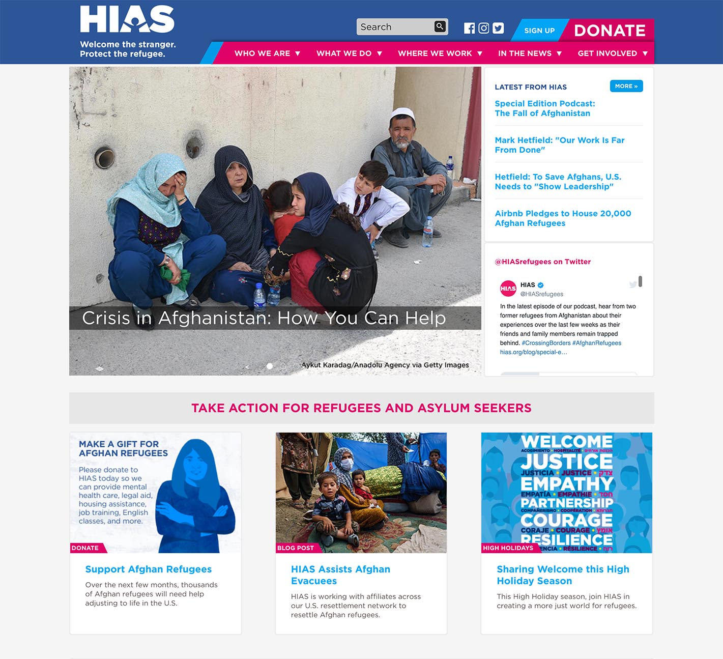
The homepage of HIAS opened with a heart-tugging image of people who appear to be homeless Afghanis at the top. The header text was “Crisis in Afghanistan: How You Can Help”. This is a great, bold message that immediately lets the user know that they’re on a website that is going to give them an opportunity to help. The sidebar of links offers blog articles covering the story of Afghan refugees from many angles; the blog articles allow for in-depth reading and repeat the call to donate and help.
Not only do these pages clearly, warmly and easily offer plenty of information for a visitor looking for information about helping the Afghan refugees, this organization’s website is one of the few that appears organically on the first page of Google results for a search for “usa refugee organizations”.
hias.org »
INTERNATIONAL RESCUE COMMITTEE (IRC)
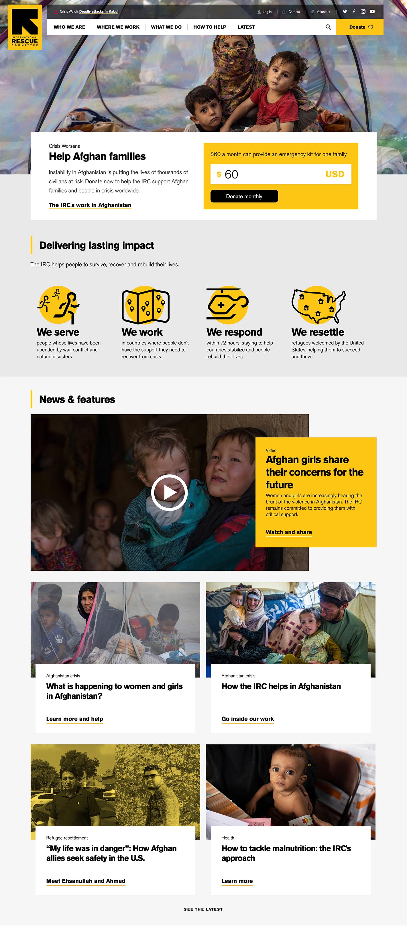
The IRC is probably the refugee-serving organization with the highest public profile, helped by hiring the already high-profile and public relations-savvy David Miliband to be their President. Besides all the interviews and appearances Miliband does, if you search for “usa refugee organizations” they’re high in the organic results; they also use Google advertising to be sure to be a top result and I’ve seen IRC ads in my Facebook feed. This is such a good start.
And then: their homepage. Not only do they have a banner area that pivoted well to focusing on the crisis at hand, the IRC homepage when I visited was largely devoted to stories relating to Afghan refugees. There was an Afghanistan-related video for those who like to watch a video, four Afghanistan-specific blog articles, two Afghan-specific press articles and then several sections of potential donor-reassuring material like testimonials, annual report and a story about how refugees are giving back to America. This is really well-crafted and presented content—and it’s all on the homepage.
On the whole, this organization really knows how to pivot—and doing the excellent PR work puts them in the spotlight so that they become the “well-known” organization, which attracts funds and allows them to have bigger budgets to do more work.
rescue.org »
US COMMITTEE FOR REFUGEES AND IMMIGRANTS (USCRI)

USCRI gets even better organic search results than IRC for my search for “usa refugee organizations”. They also use Google ads to increase their findability.
And they have a really effective and well-pivoted homepage. The banner image shows people who are clearly refugees (walking along with backpacks) but who look intelligent, resourceful, positive—people you might like to have as neighbors and fellow citizens. It’s a really well-chosen image. And the “DONATE” message makes it fairly and squarely apparent that your donation is for a current emergency only—that you can depend on these people to use their own resourcefulness to rebuild their lives within American communities.
Go down the page and there are stories about the Afghan evacuation and refugees. Then, beautifully spaced out, there are background stories about the organization itself.
And where does the big homepage “Afghan Assistance Fund” take you? It takes you a page that declares “Donors Like You Help Us Change Lives” and then, with just a little more supporting text, there’s the simplest donation form of any of the ones I’ve found in these particular websites.
This is a website that knows how to get your attention and give you the feeling that you are actively participating in their work by donating and that your contribution is really going to be appreciated. It’s not only well-designed visually but the attention to wording and to honoring people’s impulses to be involved is exceptional.
refugees.org »
===== // =====
All in all, there’s a wide range of success and missed opportunities among the organizations I looked at for this article. I was impressed by many sites that were quick to feature the current crisis at the top of their homepage and either add stories on their homepage or on a sub-page to which the banner link leads.
I was super impressed by those websites that used images and language sensitively, keeping a balance between “these people need your help right now” and “these people are fine, resourceful people who will make their own contribution in time”.
And I was impressed by those sites that either have their search engine optimization well taken care of (and are easily findable) or who make up for any lack there by using Google ads. Google gives generous ad-grants to non-profits and these organizations should be able to quickly put together an ad campaign that targets the specific searches that will arise in a crisis.
In other sites there many missed opportunities, or opportunities not fully taken—including:
- Banner images that do not elicit a compassionate response—such as soldiers and helicopters, rather than the actual Afghani people needing refugee resettlement; sometimes auto-playing carousels at the top of the homepage—creating confusion rather than clear and helpful impact. The banner is a crucial place to make that first connection with a potential donor or volunteer.
- Inattention to the power of good page layout, as if the website presumes that interested visitors will hunt through tiny and badly-written text until they find what they’re looking for. Web users tend to presume the information’s not there if they don’t find it more or less effortlessly.
- Donation pages that are devoid of warmth or context or clear choices. Few people will make a donation without a getting-to-know-you process, some inspiration and an establishment of trust.
- Really good search engine optimization and/or use of Google ads to ensure that people who’d like to help or donate can find them. What’s the point in having a great website if no one finds it?
I take my hat off to all the organizations working to deal with the crisis. But I especially take my hat off to those who also understand the value of crafting and landing their current “story” and are ready to pivot in an emergency—and to those non-profits who understand the importance of marketing their good work as actively and strategically as any good business would. The world is full of positive people ready to be inspired to help out in a crisis and we need great website design and digital marketing to make the right connection with them.
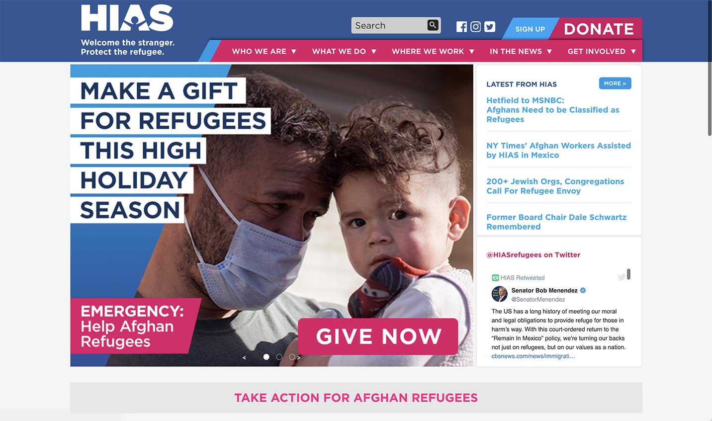
Two weeks after I first looked at these websites, I went back and had another look. I already see improvements on what I’ve described here (see one example, above—that’s a fantastically engaging image and a great call to donate). If you need to inspire and engage people for a good cause, I’d encourage you to study these websites.

