January 30, 2016
When artists first contact me to see if I can design them a website, they will often provide a few urls of sites they like by way of reference. This is helpful, as it gives me a good sense of what their aesthetic is and what their expectations are likely to be.
I’ve noticed recently, though, that there are several sites that have been mentioned by more than one person. Given how many artists have their own websites, I was intrigued that they were finding the same sites. Today I discovered the cause of this. The ones that are being offered several times are all websites that have been included in one of the top-ranking posts on something like “5 brilliant artist websites to inspire you” or “9 great artist websites”.
There is much to like about some of these lauded sites, but I’ve seen some that give no meditative space to individual artworks; sites that employ fancy features or fonts that not only don’t support the artwork but which compete for attention; sites where a plugin feature like a slideshow has been inadequately finessed to properly support the specific artist’s work (larger images bleeding out beneath smaller ones, eg) — and more.
So here are a few artist websites of my own choosing, with my tips on why I think they work well.
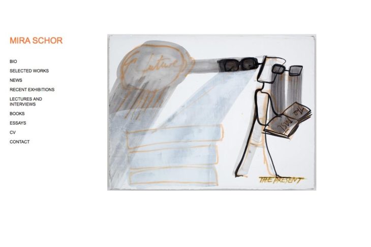
Mira Schor
This artist’s website is simplicity itself with just a touch of whimsy (the link highlight colors) and an extremely easy-on-the-eye use of an array of three images at the top of all the mostly-text pages. I really like the fact that the artist has arrayed all 107 (at this writing) of her selected works in one page of thumbnails so you can see everything all at once and dive right in to view one of your choice — with manual prev/next navigation thereafter. Everything is clear, everything is easy.
The site has not been responsively designed, so I suspect it predates the age of everything-responsive but it holds up ok on small devices nevertheless. The only thing about it that I’m not keen on is the fact that the contact link opens your mail program directly (rather than a contact page). It’s a minor detail, though, for a site that’s so exquisite.
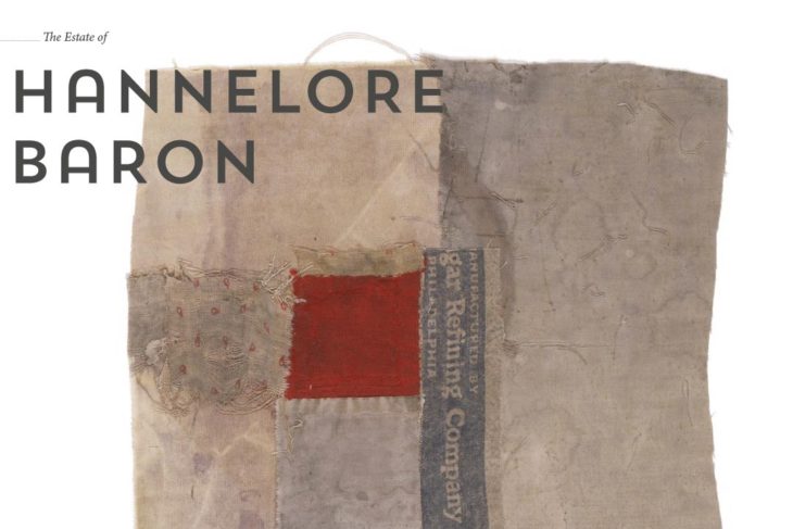
The Estate of Hannelore Baron
Both because it’s not responsive and because it has a link-free “entry” page, I’d guess this is an older site but I’m including it because it’s a site that is delightful and simple and draws you in. Even for someone like me who doesn’t like “entry” pages, that’s a good one — immediately providing a close look at one of the artist’s works. If you like it, you carry on.
Access to the rest of the artist’s work is at first via large thumbnails, three at a time, easily navigated — and then in a manually-controlled slideshow-like series which uses the full page to great effect. The life story of the artist is dealt with in a nice brief 3-paragraph “about” page and a much longer, but very easily scannable “timeline” page with a great column of occasional images down the side. Little details like the whimsical red hemispheres under the links add just the right amount of color and levity to a generally fairly zen site. This is a site that’s a pleasure to navigate and explore.
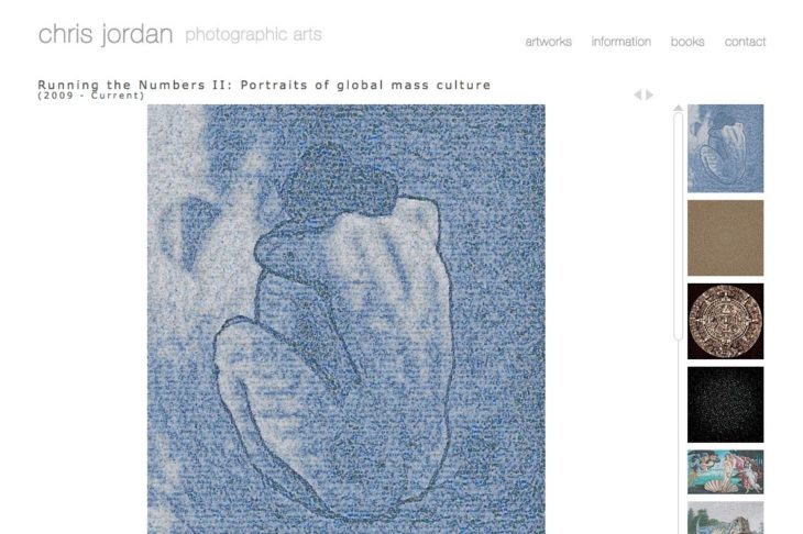
Chris Jordan Photographic Arts
This photographer’s website exemplifies the use of a special feature in a way that is perfectly appropriate to the artist’s particular work. At the time of writing, the website opens at the “Running the Numbers II” portfolio. The scrollable box of thumbnails is very nicely done but then you get this wonderful surprise of a super-slow super enlargement option. My first thought was that the effect was gratuitous, but once the zoom completed it became clear why this is brilliantly well-suited to this particular body of work.
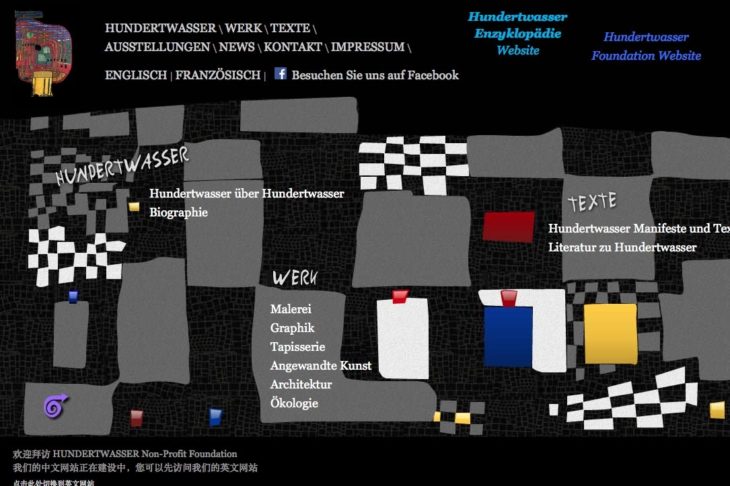
Hundertwasser
This is an old site but worth a look precisely because it is the antithesis of the ubiquitous contemporary banded/gridded layout. Hundertwasser was an eclectic artist if ever there was one and this whimsical design celebrates that eclecticism while managing to retain solid, unambiguous navigation. The important thing here is that a site can be this playful without losing an iota of good structure. A mobile-friendly adaptation could be done. For some artists, the zen, minimal look is not the right solution. This is a good example of how an artist’s site can be very personal — and hold its appeal for a longer time than those that follow trends.
Letters To Hawk
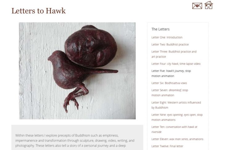
This site features a very unusual project and blends both a zen, minimal feel with an unconventional layout that echoes the artist’s original project source. The project is presented as a series of letters, with accompanying photos and videos and invites navigation that follows the journey of the artist in the creation of the work.
Laurel Hausler
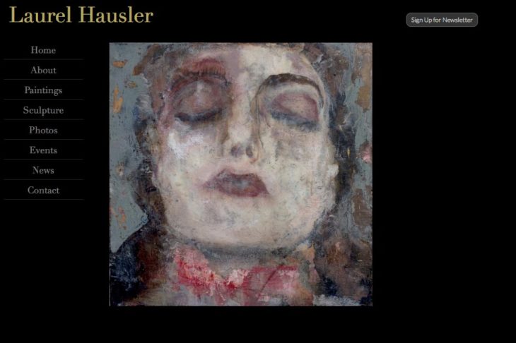
Artists often (and reasonably) want a white gallery-like background for their sites but here’s one for an artist whose work is often about the supernatural, ghostly side of our imagination. To support this quality of the work, the website has a black background and the image navigation brings the images fading-up/sliding slowly into position out of the shadows.
Rosa Valado
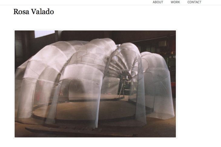
Deceptively simple, the website for this artist is completely minimal but features 100% visual navigation down multiple levels of projects within each portfolio. Breadcrumb links will take you back any level but going forwards is visual all the way. When one gets to the large-size images, slideshow navigation is by dots, rather than by arrows — which allows the visitor to see how many images there are to go.
Mondu / Peter Sahlman
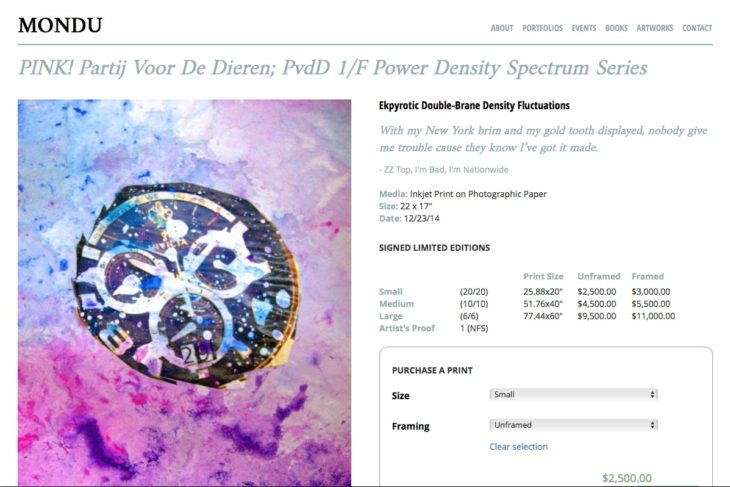
This is an artist’s website which features multiple ways to view the many many artworks on the site. The site sells prints with a full e-commerce set-up but the “buy now” options are left until one navigates to single artwork pages, preserving the artist’s initial focus on the story behind each painting. Discreet custom icons for both social-share and social-follow complete the quiet-sell approach.
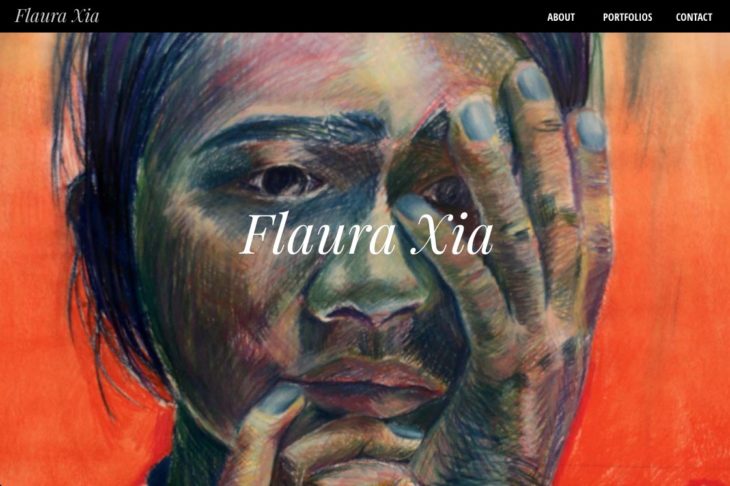
Flaura Xia
Big, bold, colorful on the homepage, this site switches to a quiet reverse for the sub-pages. The site has four portfolios of very different kinds of work and handles each one slightly differently while keeping a strong sense of continuity.
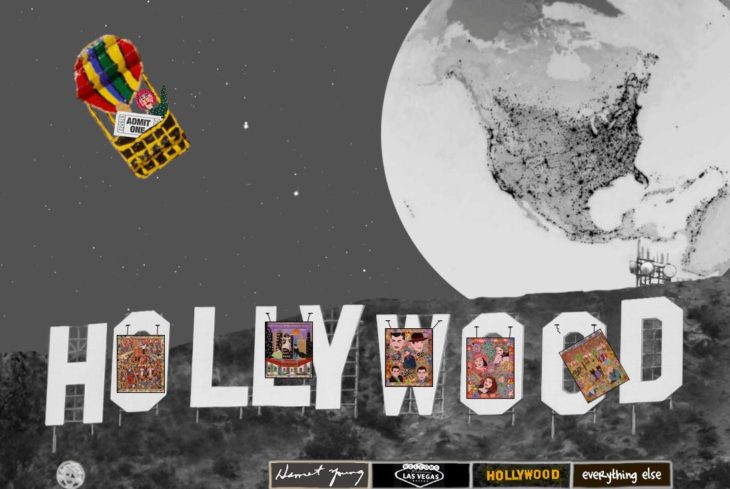
Harriet Young
I’m adding this one for its funky galleries of images and for the functionality the site provides for zooming in to an extreme degree in the paintings. As with the Chris Jordan site, the extreme zooming is appropriate in this case, as the fine details (often visual jokes) in the paintings could not be highlighted better any other way. The site is as much about telling the story of this whacky artist’s life as it is about introducing her little-known work to the public and uses imagery from her paintings in the design to help depict her world and tell her story.
Being able to see each image clearly by itself and being able to choose via visual links both seem very important to me for artist websites. Navigation in general and page clarity are important — but being able to view the work as optimally as possible and as immediately as possible should always be a priority. After that, a bit of storyline about the artist, some frequent updating and making it easy to contact the artist… and you’re all set!

