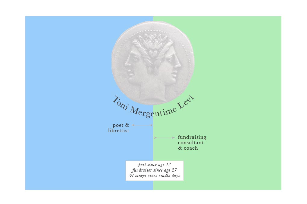
Some clients have no idea what they want their website to look like and that’s fine. Some have quite a strong idea and this was one of those. This was the client’s concept:
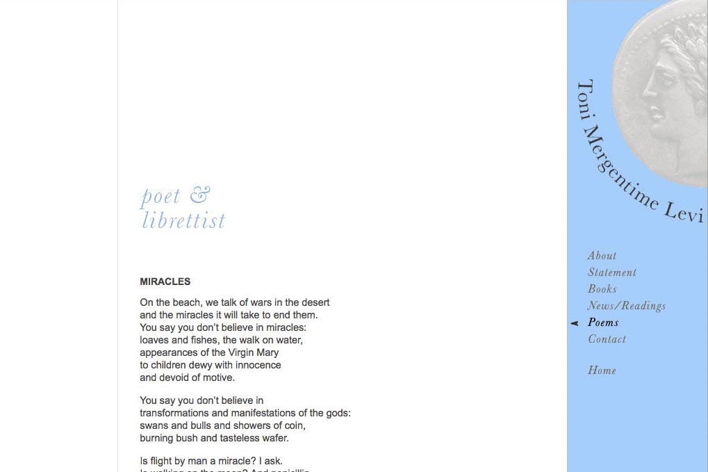
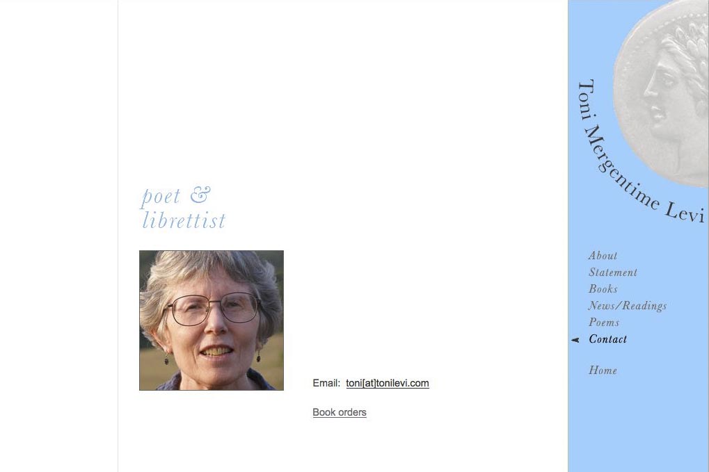
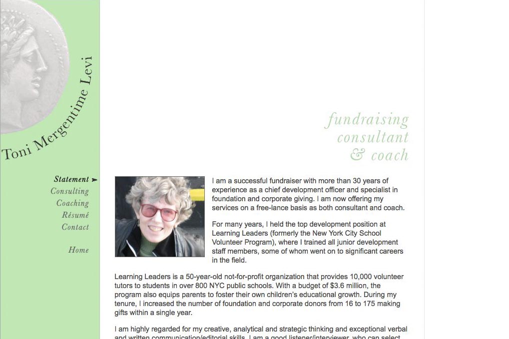
I would like the Janus figure on the home page (top center), with the page split into a pale blue side on the left for Poet & Librettist and pale green on the right for Independent Fundraising Consultant. And then I’d like to continue those colors as background their respective sections, adding a small title (Poet & Librettist or Independent Fundraising Consultant) at upper left of each page to remind people where they are.
I am thinking about having a general paragraph about myself on the home page, in a frame that is centered across the two colors. Maybe the background of the frame would be white. Visitors would click on Poet & Librettist or Independent Fundraising Consultant to enter the pages that belong to each.

Category: authors