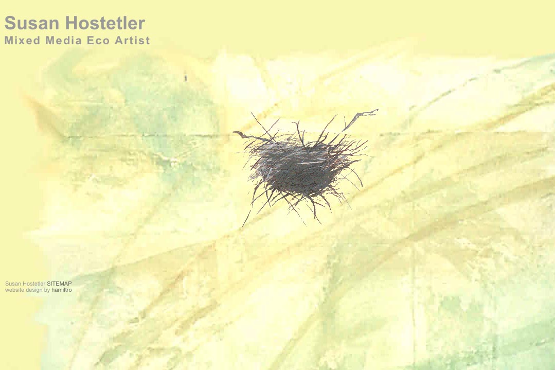
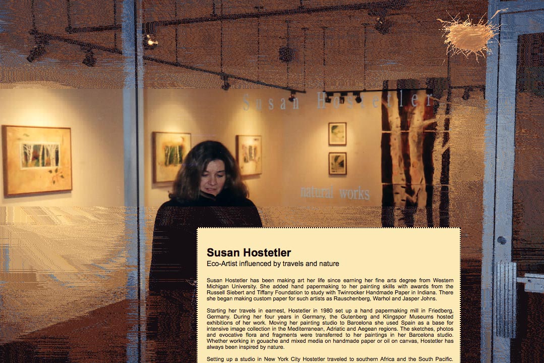
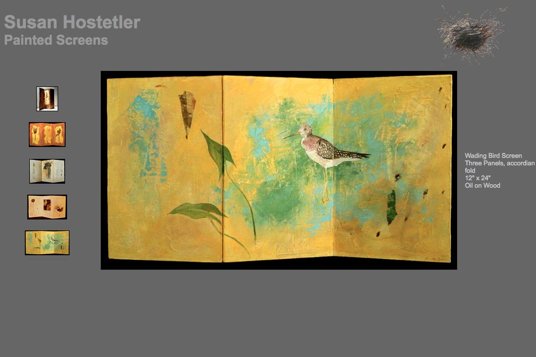
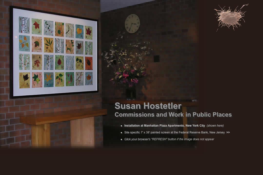
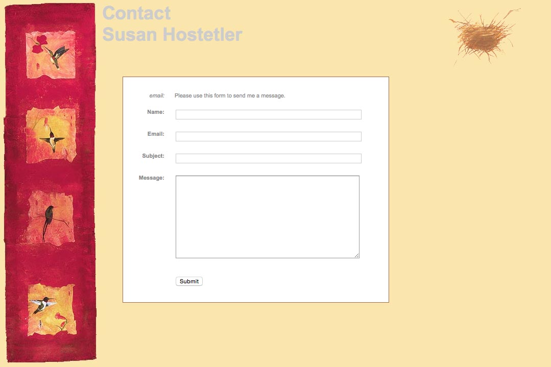
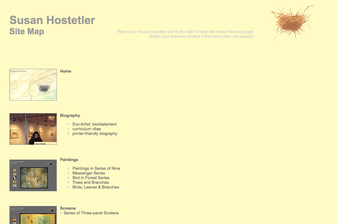
This website was designed for an artist who creates work in many different formats and allows for very wide images to display as well as tall thin ones. An early website design, each section was handled slightly differently, to give the site a playful appropriate for the artist’s work. The navigation was managed via a floating nest (from one of the artist’s paintings) which produces the menu as one hovers over it. The nest’s strong presence on the homepage signals its function for the rest of the site.
Category: artists & galleries


