This is a website redesign for one of our oldest clients. We’d made her earlier sites but it was time to bring the old site up to speed for all devices.
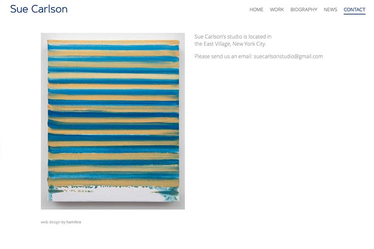
The most important thing for this artist’s quiet, contemplative work was to ensure that the entire site functioned as quietly and wordlessly as possible.
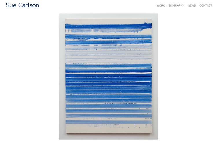
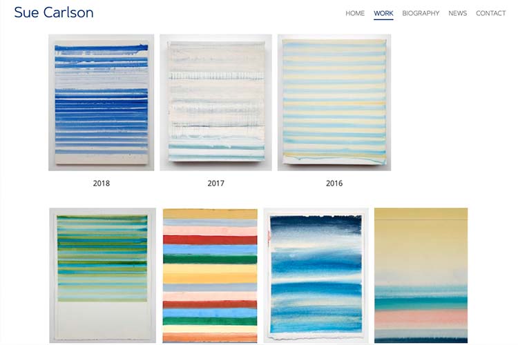
To this end, we arranged her portfolios of work simply by year and with a large thumbnail to represent each year and a large thumbnail to represent each image within each year-group. The images are left to speak for themselves.
Some of the images are extremely subtle in their detail and we put in place the option of uploading a super-large, high-res image that can be popped open in a new window for these while lower-resolution images are used for the main pages. The higher resolution images take longer to load so they are an option for those who particularly want to see the detail of the paintings.
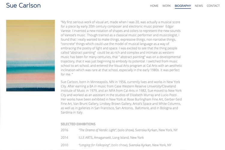
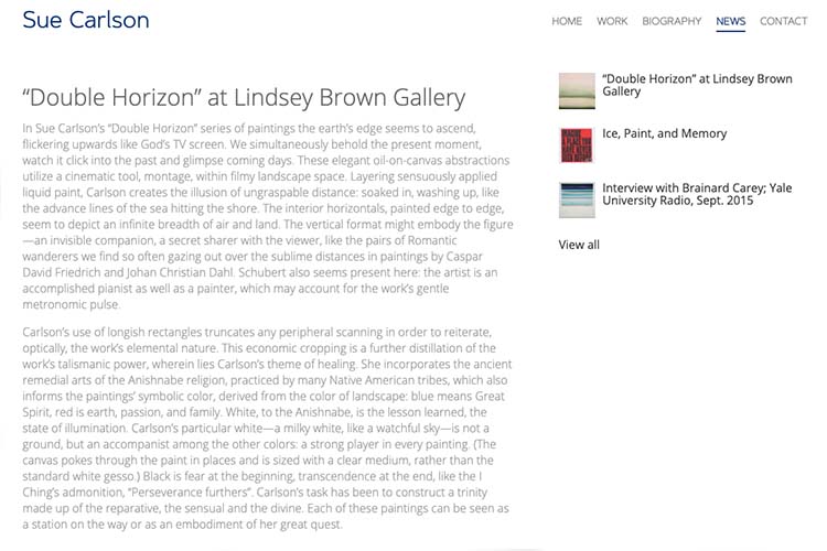
The site also has a section for news and an upcoming section for “studio” (which will include articles), so the artist is not presented without descriptive (and searchable) content and can share her achievements and thinking for those with time to read.
Thanks again, the site looks great and I look forward to ongoing putting more work and stuff up on it.
Category: artists & galleries


