September 26, 2021
Why would you design an artist’s website with a long-scrolling homepage? Doesn’t that go against the minimalist “gallery” look?
An early trend in website design for artists was to feature one work of art on the homepage and leave it up to the user (visitor) to choose to click a link from the navigation menu to view anything else. A lot of artist websites still use this design idea for their home pages. It’s the “gallery” look—and it can be very impactful if your visitor happens to love that image.
Over time, the one-image homepages evolved from being an image centered in the screen to being a more dramatic full-cover image or sometimes a carousel of images changing. A lot of artist websites still use this design idea for their home pages, too.
But something else that we’ve been exploring for a while is the idea of a long-scrolling home page for artists. This is a design idea that has become common enough in other types of websites—for example organizations that use the long-scrolling page to introduce their mission, their services, their client-base, their testimonials, etc. But it hasn’t become such a common practice for artist websites.
It’s my sense that the reason for this might be that so many artists use DIY website builders—and those website builders and templates don’t provide any guidance in best-use practices.
So what is the benefit?
Engaging Your Visitor
The main benefit of a long-scroll homepage is to engage your visitor before they lose interest.
People often abandon their visit to a website from the first page they open. And unless you study the data on the patterns of visitor behavior on your website, you won’t know how often it’s happening to you. It’s probably much more than you thought—and often because you didn’t engage the user straight away.
This can be true of any website if the person has opened the website and it actually isn’t a relevant website for them. It also happens, though, when you have content in your website’s sub-pages that might interest them but they can’t see that it is available (without clicking).
Every time you require a user to click a link you’re asking them to make a decision. And every decision you require a user to make before they can progress further, the more you wear them out.
If your visitor can at least get an introduction to you and everything you do and are doing before they have to click to another page, you have that much more of a chance to gain their engaged interest. One section may interest them more than another. Let them scroll down to see what there is in the main sub-pages of your site so they have a better sense of where they’d like to explore.
Can a long-scroll page be confusing? Yes it can. But if you design it carefully and differentiate each section visually, the user can have an easy experience. Scrolling down a long page is not mentally taxing if the page is well-designed.
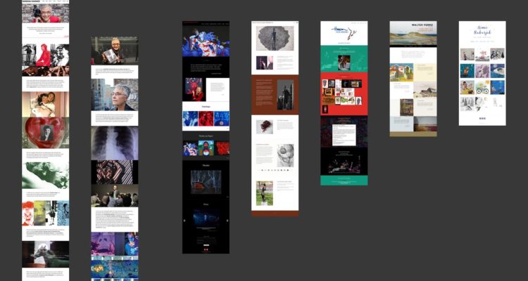
Examples of Artist Websites with Long-scrolling Homepages
Here are a few examples that we’ve designed (click the images to view the actual websites):

Barbara Hammer was an artist whose personal life influenced much of her activism and art-making so we used the opportunity of the long-scroll homepage to tell that story.
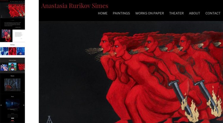
Anastasia Rurikov-Simes is both a painter and a theater designer. Having this long-scroll homepage gives the user the opportunity to get a good sense of her two main bodies of painting work as well as her bio and theater work.
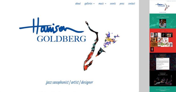
Harrison Goldberg is another artist whose work spans visual art and performance. His long scroll homepage expressively introduces the artist, his portfolios of artwork, his upcoming events calendar and his music (video). It’s been said of his work that there is a synergy between his jazz playing and his visual work and this page allows that to be seen.
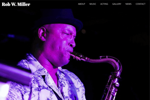
Rob Miller is another artist whose works spans two fields—in this case, music and acting. This long-scroll homepage creates an expressive introduction to the many faces of his performing life.
Click any of the images to view the websites live.