
August 31, 2017

WHY DOES IMAGE SIZE MATTER?
If you upload very large images to your website, it will cause the page to load slowly. This can result in users losing patience and abandoning your site. It can also result in Google down-ranking your site and leaving you out of search results.
Technically, you can almost always upload an image at a size much larger than is needed and your content management system will handle it in a way that displays it as if it’s the perfect size.
What your content management system probably won’t do, however, is resize your image to the absolute optimum size so that you get both best resolution and smallest file size.
You may find that your content management system has created smaller versions of your image that have small file size so the page loads quickly—but the images are blurry. Conversely, you may find that the content management system is using the original image you uploaded (which may have a huge file size) and is just displaying it at smaller screen-size.
This is why it matters that you find out (or figure out) what the maximum size an image might be displayed at on your site before you prepare your images for uploading.
WHAT ARE YOU USING YOUR IMAGES FOR?
You will first need to know exactly what kind of usage the images are needed for. You might be thinking about background cover images, banner images, portfolio images (with thumbnails, medium images and enlargements) or you might be thinking about images to place within regular text content like articles. I’ll cover all these situations and give you some examples to help you make your decisions.
IMAGE SIZE FOR FULLSCREEN COVER IMAGES
If you want an image to cover the screen from top to bottom and from side to side no matter what the screen size you should use an image that is at least 1500×740 if you want to see detail. 1900×900 is even safer and you may like to go as large as 2500×1200 if you want to achieve high detail on really large screens. You can get away with smaller images, however, if you are focusing on foregrounded content and don’t need the cover image to be much more than an impressionistic background.
Below are links three examples of cover images at various sizes (please click the thumbnails to view the websites on which they are used):
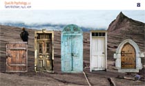

The Qualife Psychology website uses an image that is 1500 x 740px.
The Flaura Xia website uses an image that is 1824x1579px. This nearly-square format (after experimentation) gives the best result on variably-oriented screens (portrait/landscape).
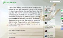
The Flictions website uses an image that is smaller than most computer screens (800×450) as it is being used very much as an impressionistic background image with foregrounded content being much more important.
The other important consideration when choosing a cover-screen image is that the image will almost never be seen in its entirety. As it will be viewed on devices that do not match the proportions of the image, either top/bottom areas will be cropped or one or both of the sides of the image will be cropped.
It is a good idea to make smaller versions of your cover images for mobile devices (1024×1024 are pretty safe minimum dimensions for all mobile devices) and you might consider making different images for portrait and landscape views if there is no way to get your image to look good in both orientations.
If you are using a computer to view the above websites, try resizing your browser window to see how the image auto-crops itself and then view the sites on mobile devices to see how the same images appear there.
The image below shows:
(i) four grey areas representing available space on computer screens that are 1024px wide (under the green), 1440px wide, 1680px wide and 2580px wide.
(ii) a blue blue outline representing the dimensions of a 1500x740px background image. Clearly you’d want to make a larger background image for the super-wide screens if it were important to have crisp detail for these users but you can see that a 1500x740px image or a little larger is a decent cover size to handle computer screens that are ≤1920x1080px.
(iii) typical screen areas available to tablets (green) and mobile phones (red). Phones and tablets, though smaller devices, tend to have higher resolution than most computer screens, so their pixel dimensions look larger here. From this you can get a sense of how much of your cover image might get cropped at the sides or top and bottom as the device is viewed in tall or sideways mode. It’s a good idea to make sure the important part of a cover image is in one area of the image only so that it doesn’t matter if some gets cropped.
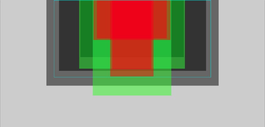
You can check this website for information on common screen sizes in use: www.w3schools.com. These statistics are changing every year, with the trend being towards larger and/or higher resolution screens.
IMAGE SIZE FOR PARTIAL SCREEN BANNER IMAGES
If your website is going to have a banner image that is less than half the screen height (allowing visitors to see content below the banner as soon as they open your website), you might want to make it a maximum height of about 400px as it is common for a computer screen to have less than 680px of height available to view the page content.
Consider the following two examples (click the thumbnails to view the websites):

For the Wampler & Souder website, because the banner does not stretch to the sides of the screen (unless the screen is small), the image did not need to be super-wide to be high resolution on all devices. The image used is 1217x382px.
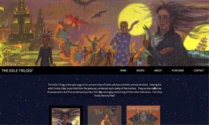
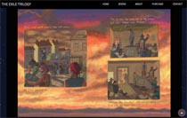
For the Exile Trilogy website, the banner image does reach to the sides of even very wide screens, so the client made a super-wide painting just for this purpose—keeping all the important visual content in the center of the image so it doesn’t matter that it doesn’t display for most users.
The actual banner image for the Exile Trilogy website looks like this (and is 2460x400px):

As you can see, the most important visual information is all focused in the center, while the added detail at the sides maintains the integrity of the image when seen in full.
We made a separate 300px high version for tablets and a 200px high version for mobile phones. You can make rules in your stylesheets to use different images for different devices.
IMAGE SIZES FOR BLOG CONTENT
Image sizes for your blog are easy to figure out (at least the maximum size you need) because you just need to know the maximum width of the content area for your blog content.
For example, the maximum width for this blog content is 730px. So I make images to be 730px wide and allow the styles to re-dimension the images responsively as the screen gets smaller (by resizing the browser window or by using a device with less than 730px screen width). Here’s an example of a 730x222px image:

At 222px high, the image is enough to break up the text and be fully viewable, while allowing the reader to continue reading without losing track of where they are. You can use taller images but keep in mind this balance of providing visual interest without losing the continuity of the text. I tend to try to keep images to 400px high or less.
There are blogs that use a wider area for text but I don’t recommend doing this as very long lines of text are difficult to read (the optimum line-width is actually slightly less than on this page). If you are interested in reading about this, you could start here: Readability: the Optimal Line Length
Below are two images that will both display at a max-width of about 335px (because of the way I’ve coded them in) but the first one is actually almost more than twice the file-size of the second one:


Both images are 1024x680px but the first was saved at 6-quality (and is a 353kb image) while the second was saved at 3-quality (and is a 174kb image). Unless you particularly need your image to be capable of being displayed at really large size with fine detail, it is best to upload it at a lower file size. Your pages will load more quickly. As long as your site is coded to force the images to display small, you can use the image-quality options to achieve a small file size even if you are uploading a larger image.
IMAGE SIZES FOR SLIDESHOWS AND PORTFOLIOS
Considering that the height of the space available for viewing your web content on most computer screens is less than 680px (after the browser’s address bar, tabs and bookmarks, etc have taken up some space), you will do well to make your slideshow or portfolio main images 600px-high or less (I tend to recommend keeping that to 500-550px to give some breathing space). Remember that within your window you may have other information you want to be on display—and that may include the site header and navigation and it may also include image captions and prev/next navigation.
Two possible reasons to make slideshow images larger (perhaps 800-1,000px high) would be either to enable enlargements (directly from the image you are using at a smaller size in the slideshow) or to display your slideshows at a larger size for the much-larger screens that are available. Larger slideshows can work well for large subject matter (such as landscapes) but be careful making too-large images of objects that are small (such as rings in a jewelry website). All the elements in your website need to maintain pleasing relationships with each other and with user expectations.
For either reason, it is worth considering making more than one version of your image to be used for the different situations rather than just uploading one very large image that will get resized by the system or by your responsive styles displaying the image at smaller dimensions. You can ask your designer/developer to code your site for this kind of image precision and you can ask her to set your site up to automatically create the sizes you need from one original image if you do not wish to do this manually for all your images.
Whatever you choose, the height is usually the dimension by which to size all your images for a slideshow or gallery, as wide or tall images that are 550px high will both fit inside a computer screen and responsive design will re-dimension your images to fit inside smaller screens as needed anyway.
Below are links to three examples of main-image treatments using different image-heights—780px, 500px and 1600px (click the thumbnails to view the actual websites):
In the case of the Exile Trilogy website (the first example), where the user scrolls down the page to see one image after another, the choice was made to use images at the absolute maximum height that could fit in most computer screens (780px) in the interests of displaying the image at greatest clarity without the need to enlarge. The image shown is 1117px x780px when viewed on computer screens but smaller versions (916x640px and 640x447px) were also created to be displayed on the smaller screens of mobile devices.
In the case of the Harriet Young website, the images on the single-painting pages were all uploaded at 500px high (with variable widths) but a much larger image has also been uploaded (in this case 1786x1411px — which is a 4MB file) to enable the user to click on the image to zoom in on the detail (which is very important to the appreciation of these paintings). Making two separate sizes for these images allows the initial pages to load quickly while providing users who really want to see the detail with the opportunity to view high-resolution enlargements.
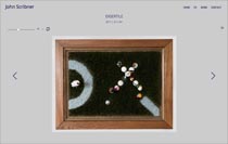
In the case of the John Scribner website, each image has been uploaded as a 1600px-high image and this is the actual image you see when you open the page—but with the images zoomed out so they display at 450px high within the page. The reason this choice was made was to ensure that it was easier and faster to zoom in than to click and wait for a larger image to load (the level of detail in these images is also important to the appreciation of the work).
The most important thing is to first decide what is most important to you (ensuring that the user sees the detail of the images or prioritizing fast-loading pages; creating different images for different screen sizes or making life simple for yourself and choosing one size to use for all, etc.). The more of your priorities you can achieve, the better, of course—but you will find that it will take more work to achieve them all.
IMAGE SIZES FOR THUMBNAILS
If you are creating a slideshow or gallery of images, you may also want to show the entire portfolio in a page of thumbnails.
Here again, even though it will mean more work, it is a good idea to make an extra version of your images at the size you want your thumbnails to be. If you are using a content management system, there will probably be a default thumbnail size set up that the system will generate for you (and you should be able to adjust the setting to the size that you want). If you find the system-generated thumbnails of your images look blurry (a common issue) you can make your own smaller images.
100px high used to be the default size for thumbnails (and it is and was common to use a square crop of your image to make a uniform grid, so these would often be 100x100px exactly).
What can happen with this size, however, is that the user can feel they see what your image is and not click to view the larger size because the thumbnails don’t quite show enough of the detail to interest them—when the larger version of the image can be something they would like.
My preference is to use larger images (150-200px high) for thumbnails or, conversely, thumbnails so small that they serve only to allow the user to identify an image they want to go back to (generally for thumbnail navigation beneath the large image/slideshow).
If you have very large portfolios and don’t want your thumbnail pages to be slow-loading, you should think about having twelve or so thumbnails to a page (with prev/next navigation) if you are using large thumbnails—or using small thumbnails if you want all the thumbnails on one page.
Below are links to three examples (click the thumbnails to view the actual websites):

In the David Harry website, the thumbnails are 30x30px crops—too small to really see what the painting is about but large enough to use as navigation.
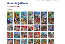
In the Susan Katz website, the thumbnails are 100x100px crops—a little too small to really appreciate each different piece but in this case, the user has clicked through from a previous page where larger images are seen first and it is enough detail for a user to choose a piece by subject matter.
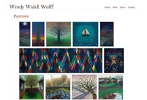
In the Wendy Widell Wolff website, the thumbnails are both 180px high and also displayed at their full proportions rather than cropped to a square version. If you choose to use non-square thumbnails the other choice you have to make is whether to use a non-regular grid (keeping the spacing between thumbnails uniform but allowing the rows to finish unevenly, as here) or whether to center each thumbnail within a square space in a regular grid (an example of which can be seen on the John Scribner website: Recent Work).
I hope that’s enough to give you some ideas. It’s worth spending time looking at websites that have content that relates to yours to refine your thinking before you decide what image sizes to use.
The next thing you need to know is how to resize images for best quality and lowest file size and I have written an article about exactly that here: How To Resize Images for Your Website in Photoshop
2 responses to “Best Image Sizes for Your Website or Blog”
Leave a Reply


HALLO ROHESIA HAMILTON METCALFE THANK YOU FOR PUTTING THIS OUT……..WE ARE FEELING OUR WAY TO BUILDING A WORDPRESS SITE FOR OUR SOUNDSYSTEM. THIS PIECE IS ADMIRABLE, ENCOURAGING.
YOU ARE DOWNLOADED FOR CONSTANT REFERENCE, HOPE THAT IS OK?
BIG BEST REGARDS, Mal H. in the UK.
Thank you.